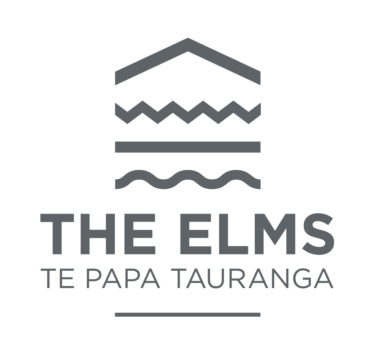
In late 2016, The Elms | Te Papa Tauranga made the decision to update our logo. Some of our strategic objectives for this project were:
• Greater awareness and appreciation of all aspects of The Elms | Te Papa Tauranga’s history and significance
• Increase “primary” visits e.g. historical appreciation, school visits, weddings
• Increase complementary reasons to visit e.g. self generated or hosted events
• Drive financial sustainability by increasing revenue streams
• Promotion of The Elms as a “must visit” destination for Tauranga
The project took six months to complete, with historical insight and broad stakeholder engagement being drawn upon to inform the final decision-making process. Needless to say we are delighted with the outcome and we hope that you enjoy reading about the process and our objectives. Here is a before and after snapshot of our brand transformation:
Marketing Audit
Our first step was to undertake a marketing audit to see how The Elms | Te Papa Tauranga was currently presented to the public. We found that there was a very mixed image and concluded that a new logo was necessary.
- We had struggled with our old logo for some time. It was designed in 1999 and never had any brand guidelines attached to it. Consequently, it had been misused and its integrity had been lost over many years of service. When undertaking this project, we counted over twelve different variations of the old logo.
- Naming convention varied considerably over time:
- Te Papa (original name for the site upon which the mission station was located)
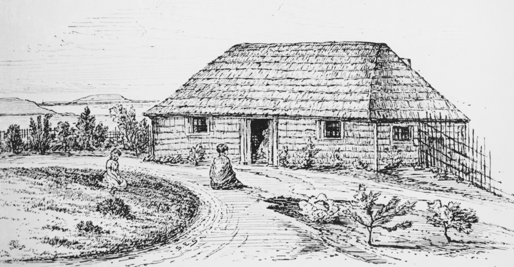
- The Church Missionary Society’s Te Papa Mission Station (1838 – 1870)
- The Elms (family home)
- The Elms Foundation (on current logo)
- The Elms Mission Station (on facebook)
- @elmsmissionhouse (email on facebook)
After the audit we concluded that there was real opportunity to improve the logo and brand. We set out to:
- create a logo that is fully representative of The Elms | Te Papa – which honours the Church Missionary Society period, but also acknowledges Tangata Whenua and the post-Mission period as well.
- to present more timeless options
- to create a logo that can be used across multiple verticals
- to create a scaleable logo
- to reposition The Elms | Te Papa Tauranga
- to have a logo that better contributes to the drive for an improved revenue stream and increased visitation
Where did we draw our inspiration from?
As we researched oral and written histories the theme of ‘four’ emerged:
- The four major phases of history at The Elms | Te Papa Tauranga’s history –
- The Otamataha Pā
- Te Papa Mission Station
- The Elms family home
- The establishment of The Elms Foundation
- The four members of the Brown family who initially moved to Te Papa Mission Station –
- Alfred Brown
- Charlotte Brown
- Celia Brown
- Marsh Brown
- The four generations of family that lived at The Elms as a family home –
- Archdeacon Brown
- Euphemia Maxwell
- Alice Maxwell
- Duff Maxwell
- The four main influences on the site over time –
- Being a community home
- Being a place for Māori and European cultures and people
- Being connected to the land
- Being close to the water
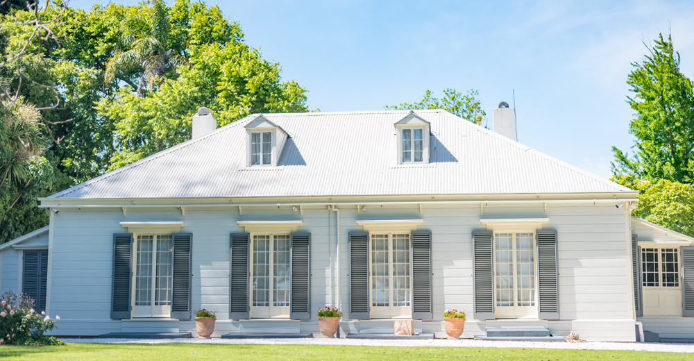
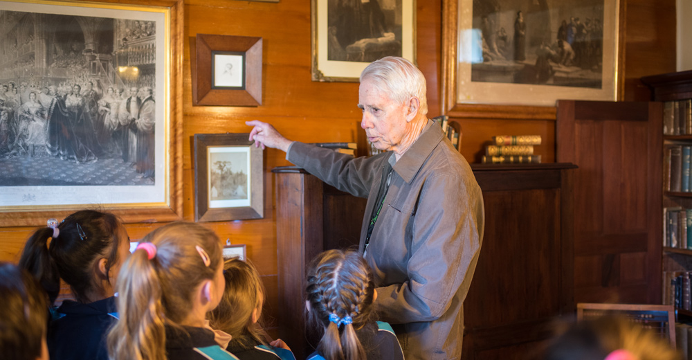
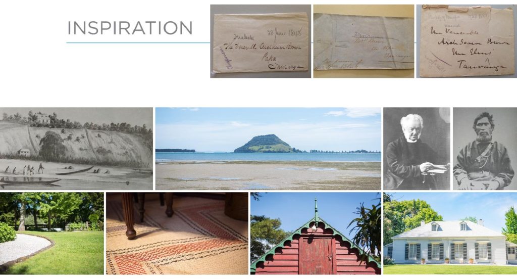
Inspiration was also taken from this photo board drawn from current photo libraries and historical albums:
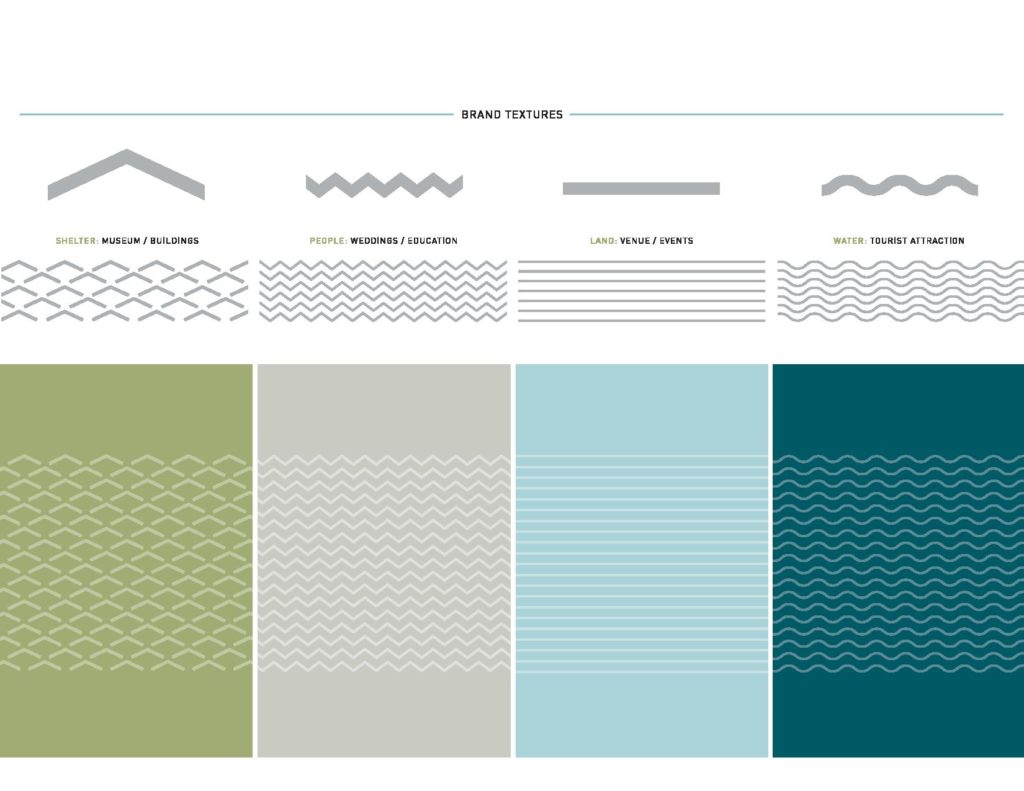
And so a new logo was created – with the four layered, specific but united, elements representing:
Of note, we move forward with the name The Elms | Te Papa Tauranga as we believe that this most accurately reflects our history and our site’s significance. We also draw your attention to the font and the colours chosen. Both were chosen for their timelessness and longevity, while on-trend colour and font options were avoided. We also felt that when used together, they best represented and conveyed the gravitas that The Elms| Te Papa Tauranga deserves.
